CA01

CA02 Strategic design

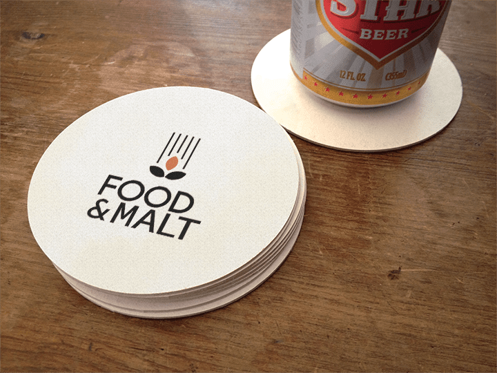
Food and Malt is a fictious restaurant, located in the Meat Bazar. They offer drinks from local breweries and good, home-made food. 

Food and Malt would like to position themselves in the restaurant-micro brewery marked as traditional but with a modern twist. 

Get to know the client

Every design project should have an analysis phase in order to get to know the client and their goals. This project is no exception. I conducted a competitor analysis and some interviews with young people in their target group.

I also did a word analysis, to find relevant concepts for Food & Malt.

Moodboard and inspiration

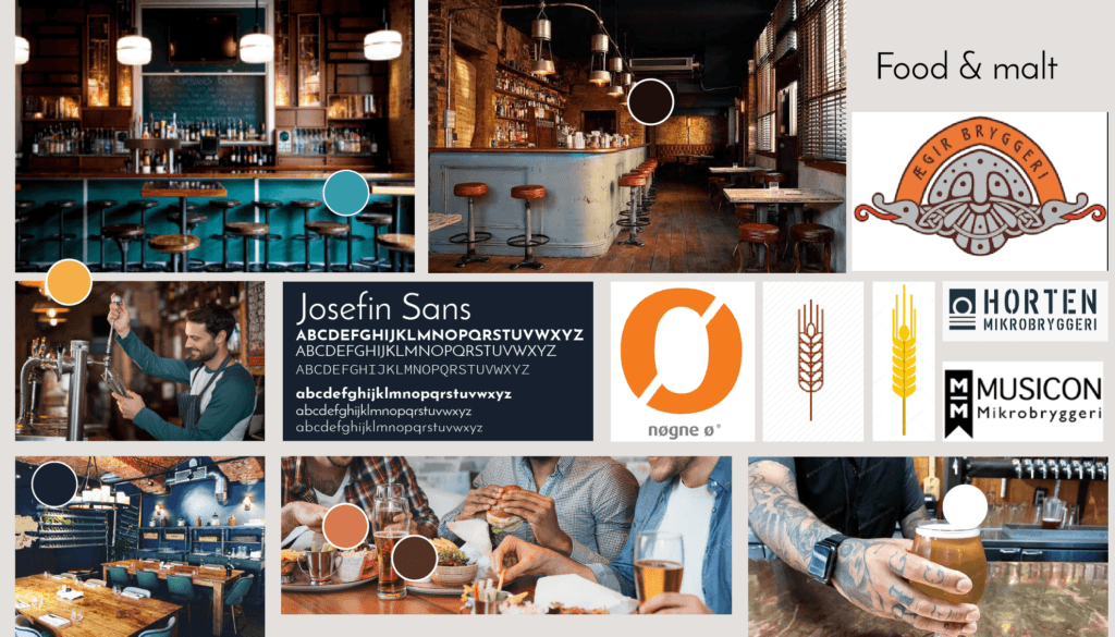
A moodboard is a place to gather visual elements that inspires. Are there certain colours that is repeated in the business. What is the general mood in the surroundings. I also used the moodboard to find colours.

Sketching, testing and execution

Sketching on paper is a quick, easy and cheap way of generating ideas. When sketching is done, some of the ideas are refined using digital tools.

The result

The logo for Food & Malt clean and modern. The logo mark is inspired by the barley that is used to make beer. The orange colour is the colour of a medium dark beer.

Visual profile

A visual profile is a system that dictates the visual appearence of a business on every touch-point they have with their surroundings. In order to manage the visual profile, it is necessary to create a visual profile manual, where the logo, typography, colours and sometimes the look’n-feel of graphical elements are described.
I have created one for Food & Malt

Semester Project

In this project, the task was to create a package of printable items for Hoser og Bånd, a small business that has specialised in crafting parts
for the Norwegian national costume, bunad. The package consists of

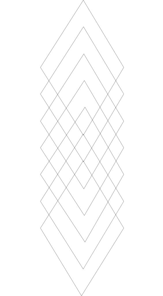
  • Logo
  • Profile manual/visual identity manual
  • Template for product catalogue applied to 6 different products
    (2 for each of hosebånd, stockings and woven bands)
  • Template for thank-you note that are sent to people when they
    have done a purchase on hoserogband.no or bought a product at Facebook or Instagram
  • Business Card for Siv Lillevik (only employee)
  • Business presentation brochure

Target persona

The ideal customer of Hoser og Bånd is everyone with an interest in our national costume and owns or is planning to purchase parts for a bunad – either for themselves or for others. To find out more of their values, I conducted a survey. The respondents were found in two different Facebook groups – both for bunad interested people, and
among my 570 friends on the platform. The participation in the survey was voluntarily and no reward was offered. The survey was published for a couple of days, and I got 222 answers before I closed it.

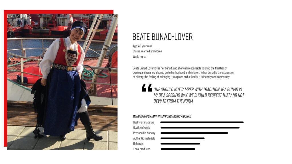
Based on the answers I got in the survey, my ideal customer is described in the following persona: Meet Beate Bunad-Lover

Inspiration and sketching

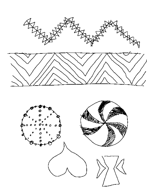
The Internet is a great source for inspiration: in this project, I used several online resources:

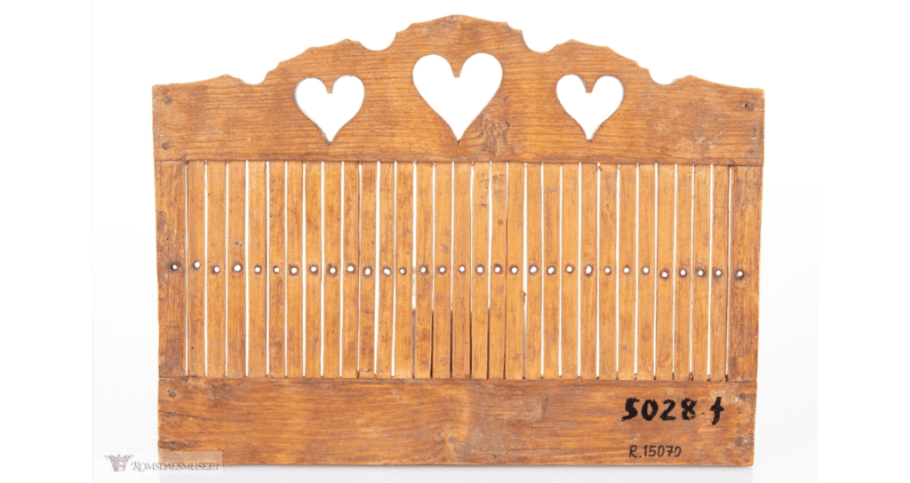
  • Digitalt museum , where old objects are photographed and displayed in a virtual museum. Here, one can find old textiles and tools, such as stockings or inkle looms
  • Google – to search for the logos of businesses that are the same or related to see how they convey the same values as my business have in their visual profile

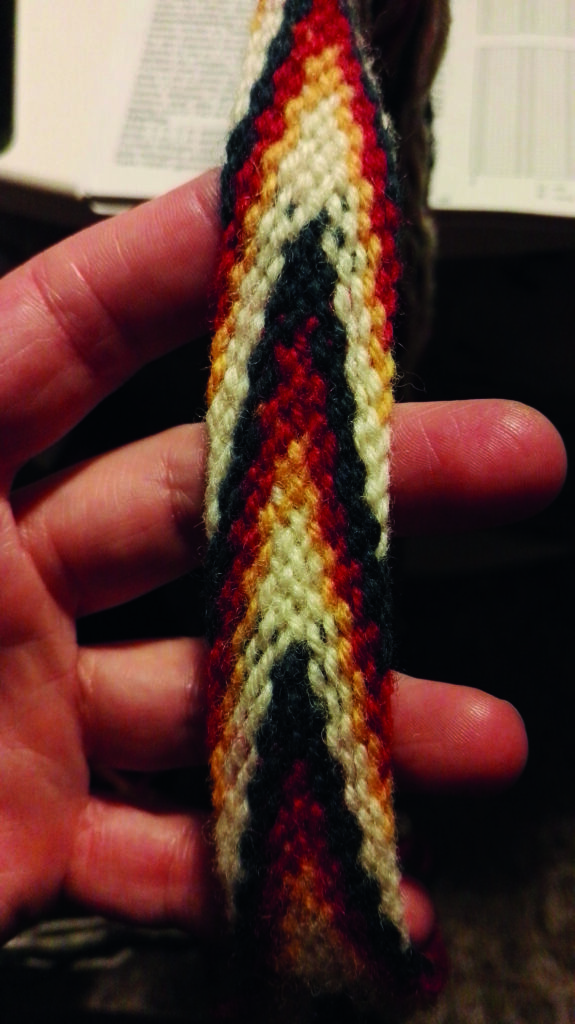
I also looked at physical products, as my hosebånd and old bunad-magazines.

The final concept

The results

The result of this project is a logo, a visual profile and a long list of print items (and a rebranded website).

CA03 Print Design

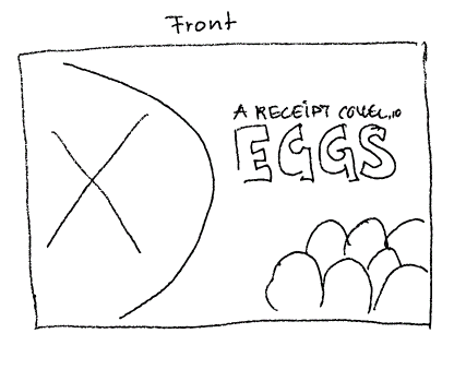
In this project, the goal was to familiarize myself with Indesign, and create a booklet for the Information Office for Eggs and Meat (Opplysningskontoret for egg og kjøtt).  The Information Office is an Norwegian marketing organisation that aims to provide vendor funded information and help on behalf of the Norwegian meat industry, for products made by eggs and meat. The office runs the website, matprat.no, where they provide information about their member’s products and recipes in various origins and food type.

The result

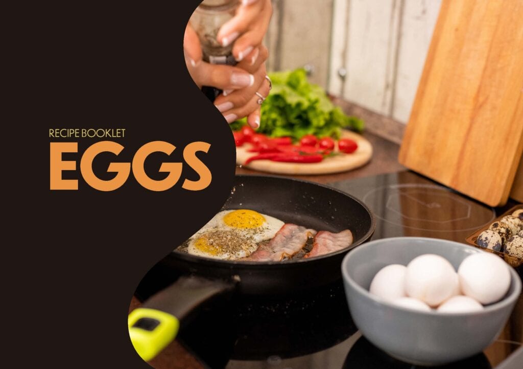
The result of this project is a 20 page, 5 spread brochure. The first version was 18 pages, but that does not add up when the brochure is printed.

I have published the brochure in Creative Cloud for you to see.

You can also view the brochure as a regular pdf file (14MB)

Inspiration and sketching

Before sketching anything I wanted to see what others have done and find inspiration in that. I looked at a few cook books that I had in hand, and found some inspiration in my cook book on Keto. I also looked in  brochures from Kiwi and Rema (local grocery stores).

Moodboard

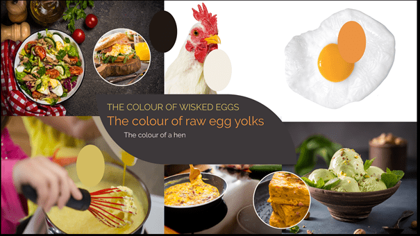
I put some images together on a mood board. The idea of the mood board is to see how to convey a modern feeling to cooking with eggs and explore the colours of such.

Target group

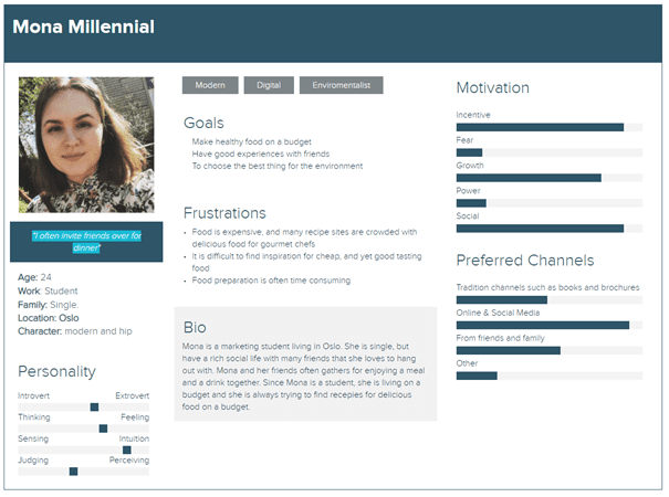
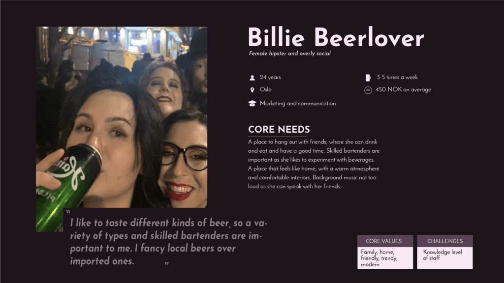
The target group is young adults and student. In order to know more about them, I did an informal interview with a young woman. Based on that chat, I developed a persona. My persona is 24 years old, single, lives in Oslo and is studying marketing at NMBU. She sees herself as modern and hip, and she uses eggs in her cooking regularly. Although her economy is not the best, she says that she always have enough money for a package of eggs.

CA04 Photography

In order to master the art of photograpy, one must master the camera with settings, lenses and all equipment needed to create the photographs you want – and so I have done.

Freeze Water

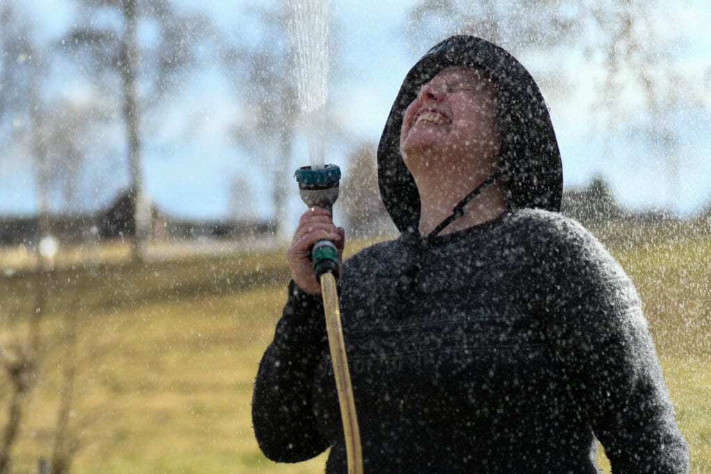
A high shutter speed is required if you want to capture water drops. Small waterdrops require a faster shutter than large water drops. This photo is taken with a Nikon D7500 DX camera and a remote control (in an app), with 10 seconds time delay. I pressed the shut – ter, hurried to put the mobile away and picked up the garden hose and waited for the camera to do it’s things. In the app I used, it is possible to set shutter, ISO and apperture. The white balance is not available, so this is done with auto white balance. It was a beautiful sunny day, so the correct white balance would be around 5500 Kelvin

Freeze Water. Shutter: 1/1000 sek, f4, 90mm 200 ISO
High key. 1/200, f18, 80 mm, 9000 ISO

High key

A high/low key photograph is a photo where the main characteristics in low contrast, and some elements that stands out. This image is taken in Elverum where I live, a winter day in February. There is snow in the air, and the moist from the river is freezing in the air and making the scenery even whiter. The contrast element here are the small pine forest in the front. They are different than the whiteness of the photo.

Contrast

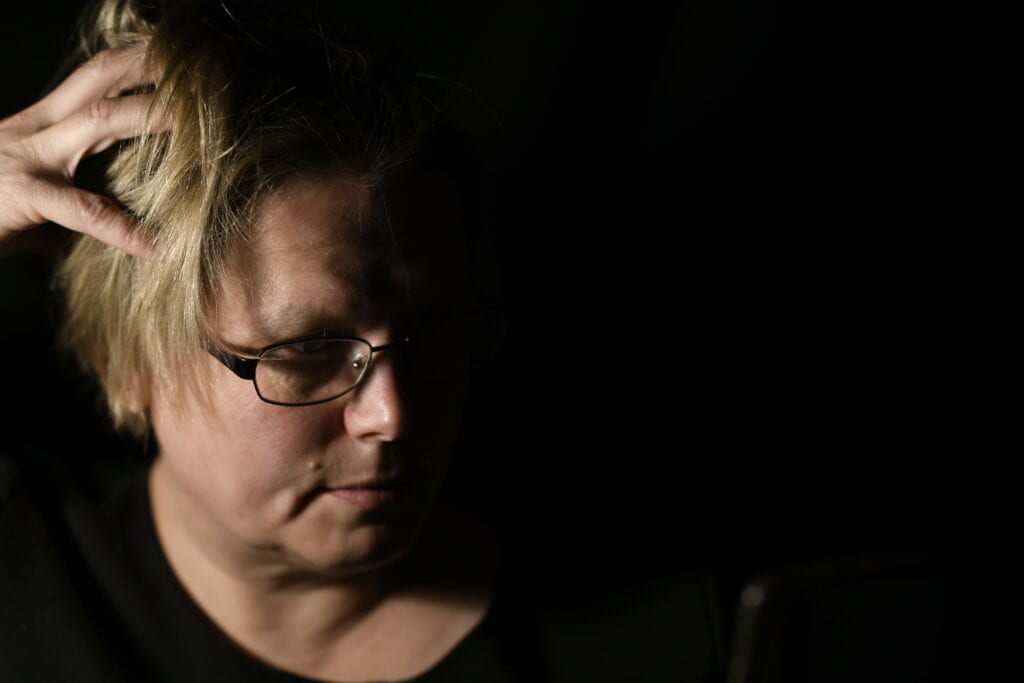
This image is taken with a Nikon D7500 DX camera, with a remote control on my mobile phone. The concept of contrast can be almost anything that makes sence. In this photo, I have tried to capture the contrast between light and darkness. The setup was an almost complete dark room and a small, intense light comming from my right. The light was angled in such a way that only half my face was lit up. I used a

Contrast 1/60 f 1.4 50mm ISO100

The rest

I have explored different techniques, which has resulted in these 10 images. I have taken loads of images during this project, and some of them are on display in my student blog. See for yourself.

CA01 Design principles

The notion of good design can often be analysed to some fundamental theories about human perception – such as the Gestalt principles. The foundation in the Gestalt principles is that the human brain is hard-wired to see logic, patterns and structure in order to easier make sense of our surroundings.

There are many Gestalt principles, but in this project the focus is on these eight:

  • figure / ground
  • continuity
  • closure
  • proximity
  • similarity
  • symmetry
  • common fate
  • prägnanz

Similarity and abnomaly

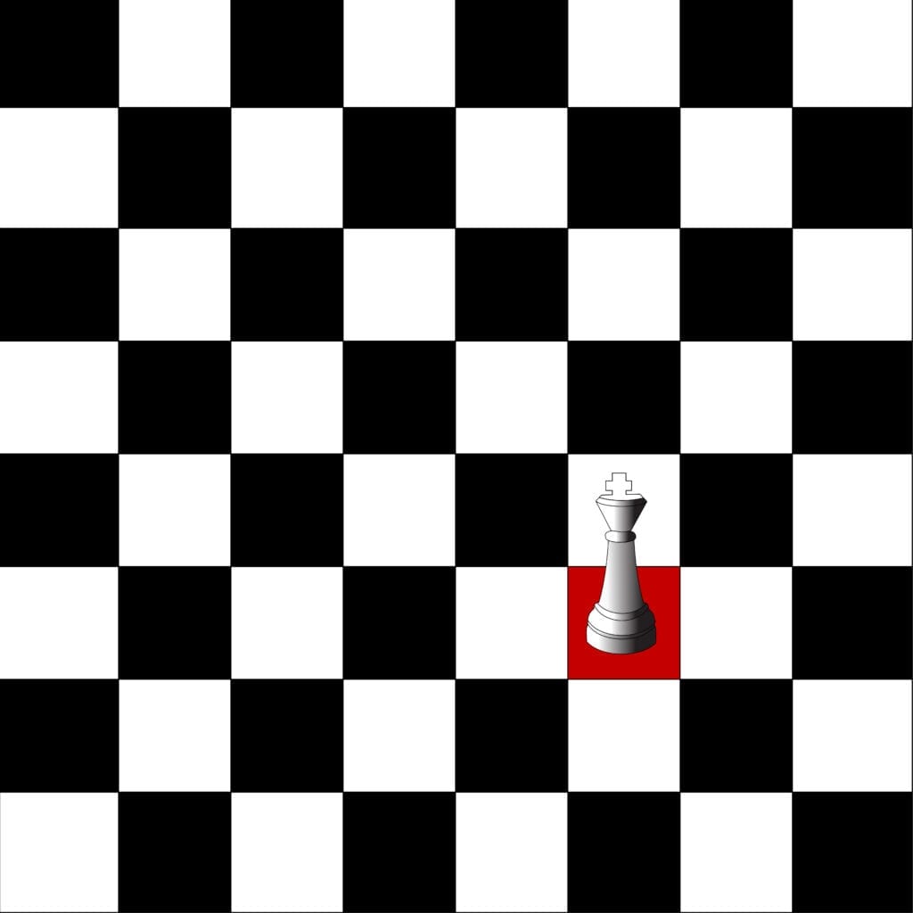
The human eye treat similarity – objects that looks the same, the same way. When something is similar in this manner, an abnomaly – or something different is easily noted. In my case, I have a chess board, with 32 white squares, 31 black squares and 1 red square. The red square stands out.

Proximity

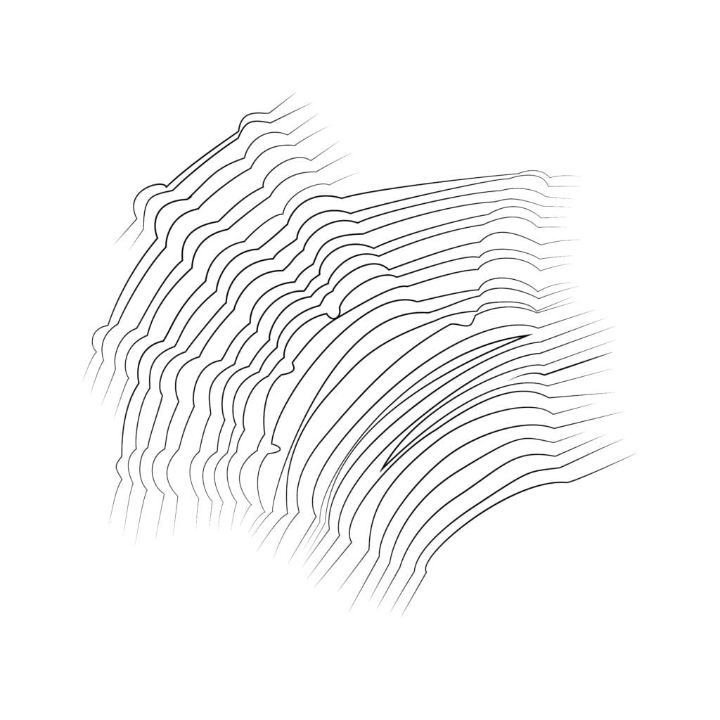
When elements are grouped together, the human eye tend to see it as a whole. In my artwork, the drawing is lines with curves. These lines make up the shape of my
hand.

Prägnanz

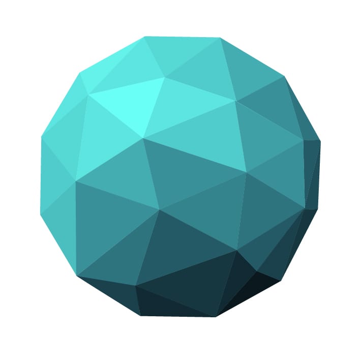
In the Gestalt principle of prägnanz, the theory is that the human eye see an object as a sum of its part – not the individual shapes that makes up the shape. In my example, I have created 35 triangles. The human eye see a round ball – not the 35 triangles.