Arkiver: Portfolio item
CA02
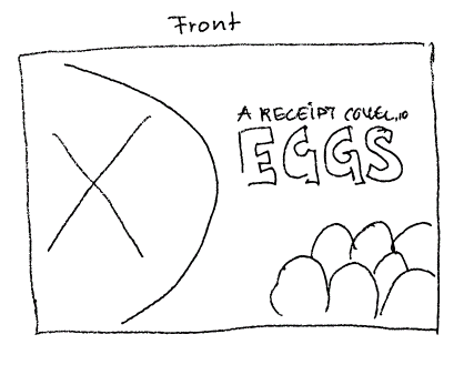
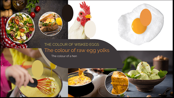
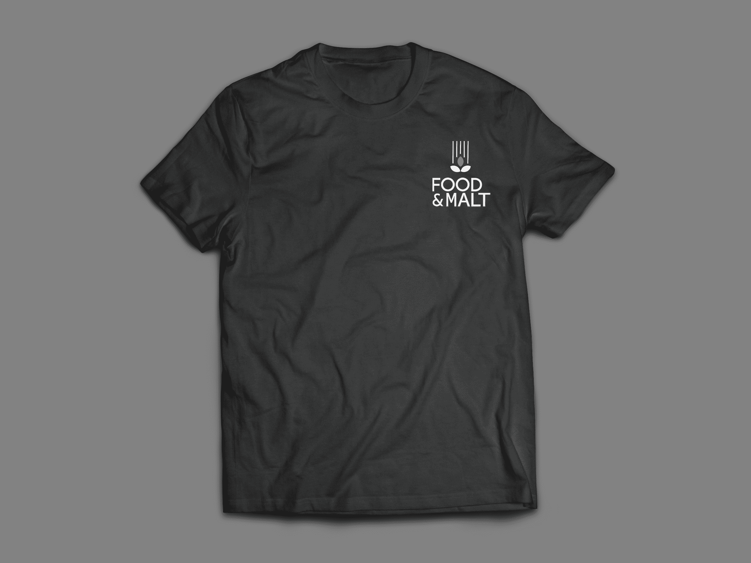
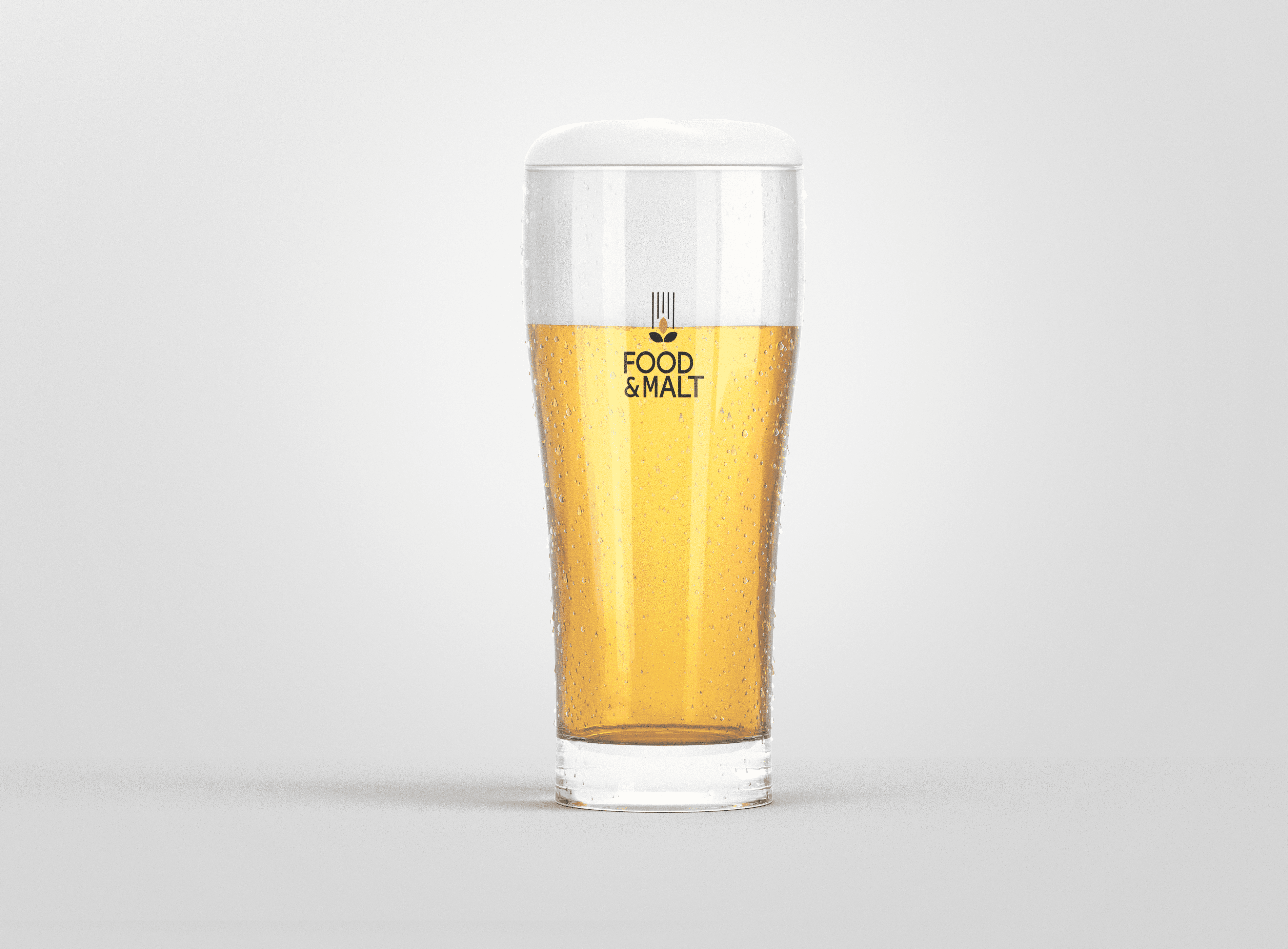
CA03 Print design
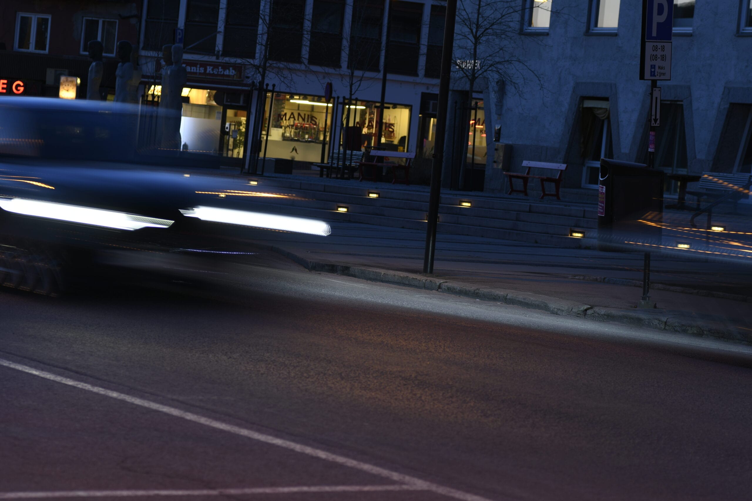
CA04 Photography
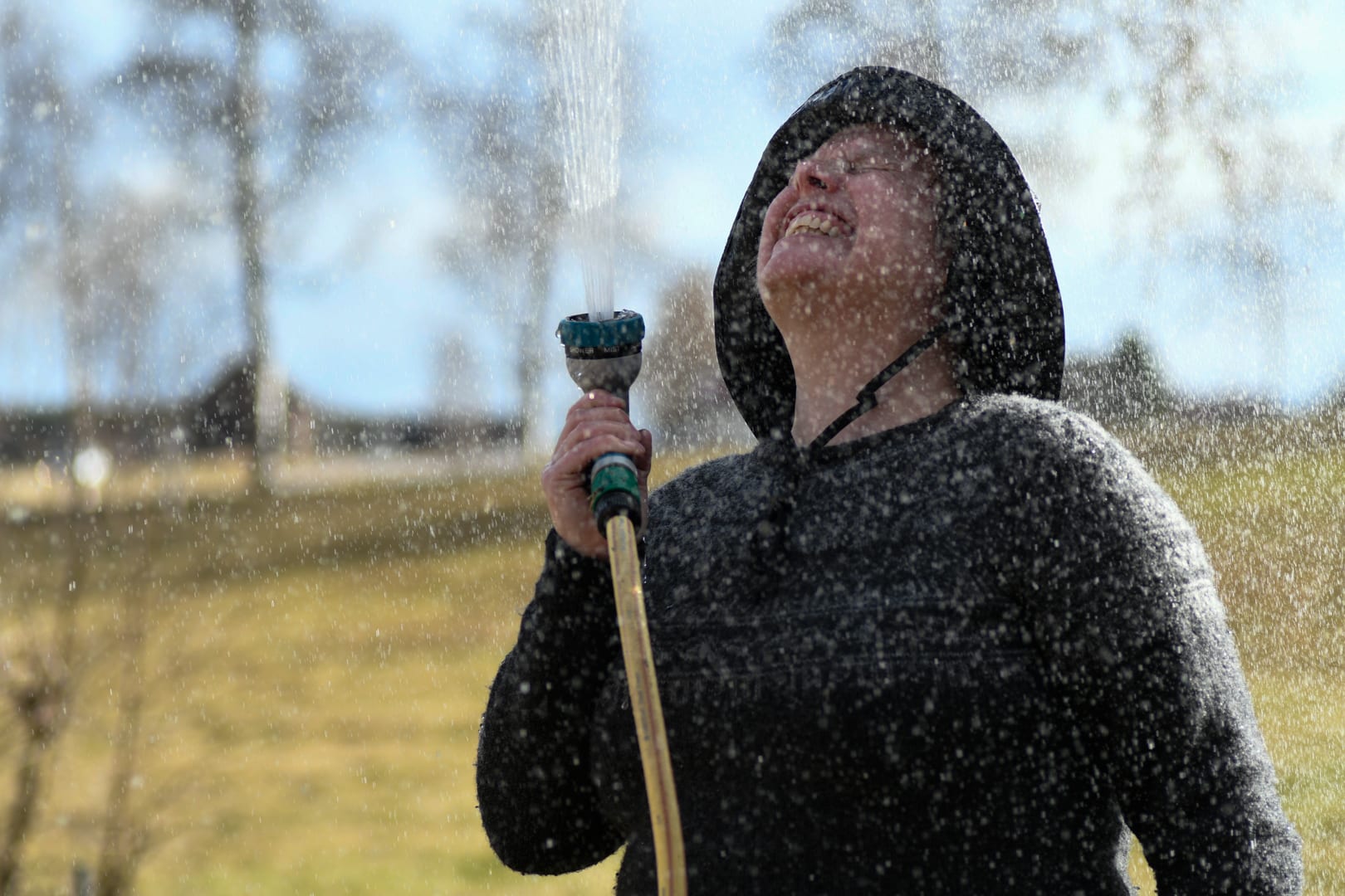
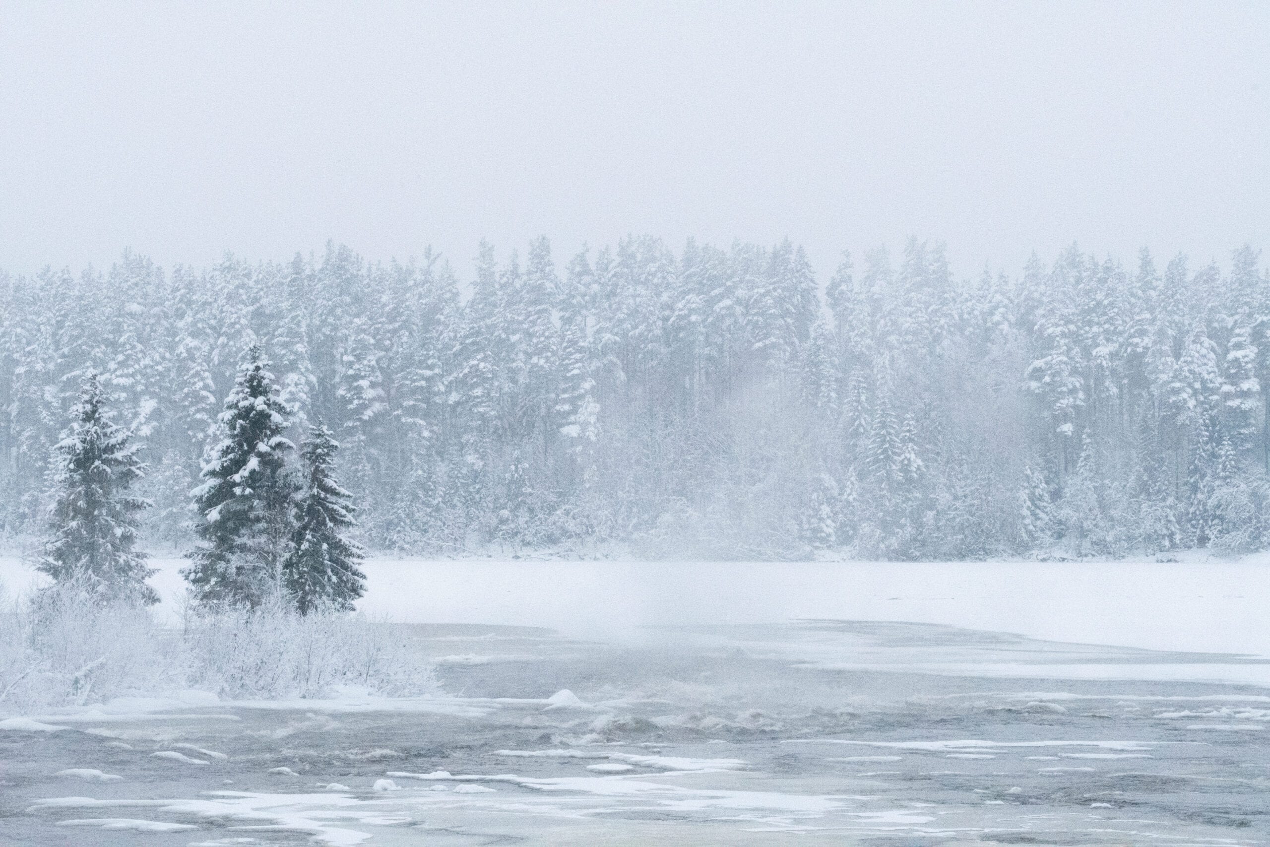
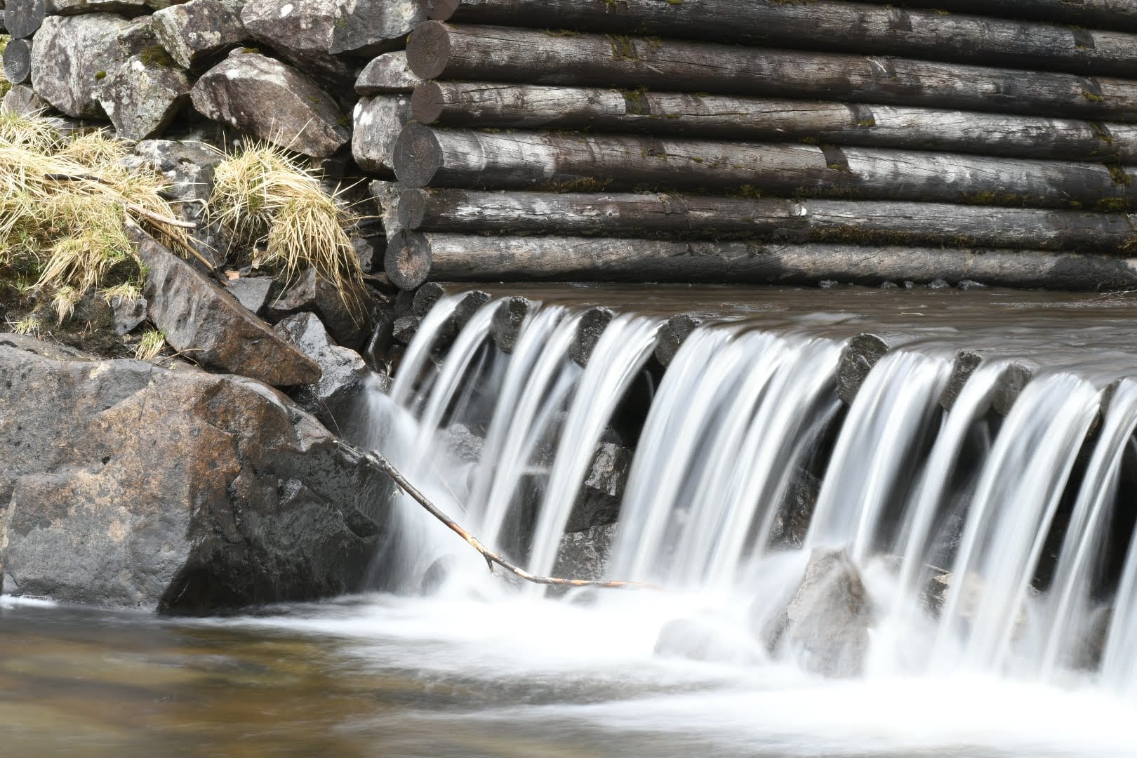
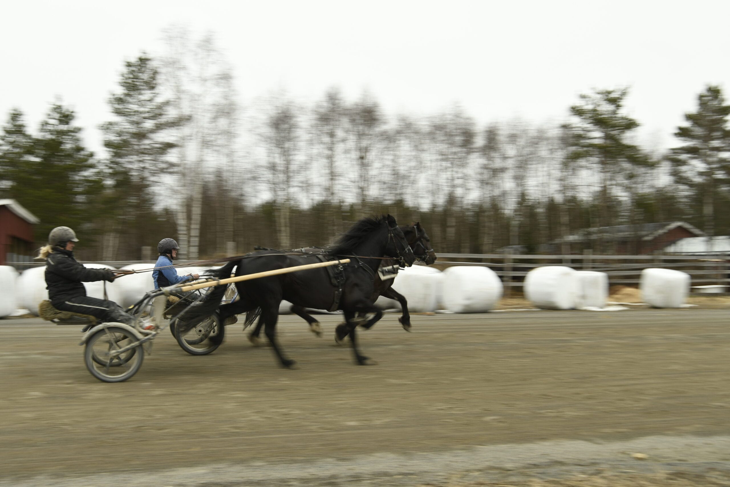
Freeze water Lorem ipsum dolor sit amet, consectetur adipiscing elit. Ut elit tellus, luctus nec ullamcorper mattis, pulvinar dapibus leo. 1/1000 sek f4 90mm 200 ISO Shutter: 1/1000 sek, f4, 90mm 200 ISO

